Choosing the appropriate color scheme plays a vital role, whether it’s for the design of a prominent project, dressing up a room in your home, or even creating a captivating piece of art. The impact of color often goes unnoticed until one is immersed in such tasks. For many, it might seem sufficient to select primary colors for their acrylic paints that bear a resemblance to the shades in a reference image. However, the real charm lies within the nuance of color selection, particularly when it comes to the subtle allure of muted colors.
In the proceeding discussions, this article’s objective is to delve deeper into the attributes of muted colors, guiding you through:
- The essence of muted colors;
- The technique for creating balanced muted color palettes;
- The persuasive influence of incorporating muted colors into artwork.
The Essence of Muted Colors
It’s easy to get swept away with bold and primary colors’ vibrancy, especially when creating art or designing a space. However, muted colors, with their understated charm, offer balance and sophistication to any design. These shades, which are primarily primary colors toned down with black, white, or a complementary color, have the ability to create a sense of calm, warmth, and delicacy.
Creating the Perfect Muted Shades
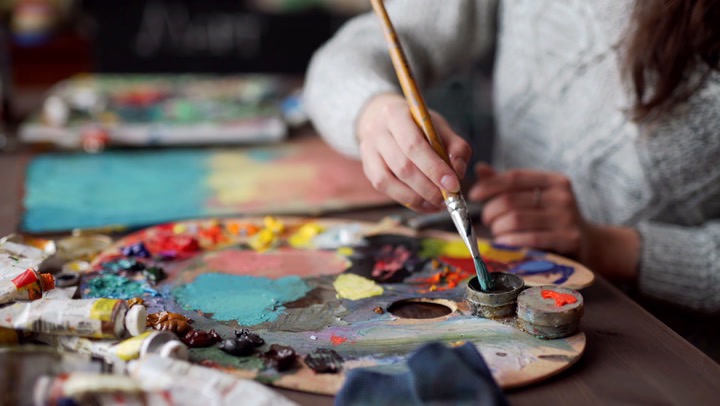
Mastering the art of mixing colors can enhance the aesthetic appeal of any project, be it a painting or a design layout. And when it comes to creating muted shades, things become a tad more interesting. The natural instinct for a novice might be to simply add black or white to a color to dull it down. However, the secret to achieving the most authentic muted shades lies in the understanding and application of the color wheel.
The color wheel is a fundamental tool for artists and designers, helping them to visualize how colors relate to each other and how they can be combined. Complementary colors, which sit opposite each other on the color wheel, play a crucial role in creating muted shades. These pairs of colors, when mixed, neutralize each other, resulting in a less saturated color.
Here’s a step-by-step guide to help you mix the perfect muted shades:
- Select a Base Color: Begin by choosing the color you want to mute. It can be any color from the color wheel;
- Identify the Complementary Color: Find the color that sits opposite your chosen color on the color wheel. This is the complementary color. For instance, if you’ve chosen blue as your base color, its complement on the color wheel would be orange;
- Start Mixing: Gradually mix the complementary color into your base color. Add a small amount at a time, as adding too much can quickly muddy your color. Continue to mix until you’ve achieved the desired level of muteness;
- Adjust as Needed: If the result is too dark, add a touch of white to lighten it. If it’s too light, add a bit of black to darken it. Again, remember to add these colors little by little, carefully observing the changes in your muted shade.
By understanding how to mix muted colors effectively, you can add a layer of sophistication to your art or design projects. Muted colors can add depth and realism to paintings, help to create a soothing atmosphere in interior design, and lend an air of professionalism to graphic design projects. They are a powerful tool in the artist’s or designer’s toolbox, and knowing how to create them is a skill worth mastering.
The Impact of Muted Colors in Art: Creating Harmony and Balance
In the world of art and design, muted colors are a powerful tool in creating harmony, balance, and depth. While bright, saturated colors often demand attention, muted colors instead work to draw the viewer in, encouraging them to spend more time exploring the work in its entirety.
A piece of artwork that employs an overload of bright colors can instantaneously capture attention, but the effect can be overwhelming, leading to viewer fatigue. The use of too many strong colors can create competition among all the elements, resulting in a lack of focal point that can be off-putting to the viewer.
Conversely, incorporating muted colors in artwork can create an overall sense of balance and ease. This doesn’t mean you need to eliminate bright colors entirely, but rather learn to use them strategically, allowing the muted shades to provide a soothing backdrop.
Here are useful tips on how to effectively incorporate muted colors in your art:
- Create a Balanced Palette: Prioritize creating a well-balanced color palette that includes both bright and muted colors. This will ensure your artwork is harmonious and visually pleasing;
- Establish a Focal Point: Use bright colors to highlight the focal point of your art. The surrounding muted colors will direct the viewer’s eye to this point, keeping their attention rather than dividing it amongst multiple elements;
- Use Muted Colors for Backgrounds: Muted colors are ideal for backgrounds as they allow other elements in your art to stand out. They can add depth and make your artwork more engaging;
- Build Depth and Dimension: Muted colors can be effectively used to build depth and dimension. They can be used to create shadows and indicate distance, making your artwork more realistic.
Incorporating muted colors into your artwork can result in more sophisticated, engaging, and memorable pieces. These understated colors not only add depth and sophistication but also create a soothing aura that can captivate the viewer for longer.
Harnessing the Power of Muted Colors in Your Artwork
Incorporating muted colors in your art requires a thoughtful approach, but the results can be enormously rewarding. Much more than just ‘filler’ or ‘background’ colors, muted shades can add depth, dimension, and visual interest to your work. They also guide the viewer’s eye around the piece, helping to draw attention to key points of interest.
To effectively use muted colors in your art, consider the following suggestions:
- Experiment with Backgrounds: Start by experimenting with muted colors for your backgrounds. This approach can create a calming backdrop against which your main subjects can stand out;
- Highlight Focal Points: Use brighter, saturated colors for your focal points, allowing them to ‘pop’ against the muted background. This contrast enables the viewer’s eye to focus on the main subject, then move around to appreciate the whole artwork;
- Pace Your Viewer’s Journey: Muted colors allow you to control the pace of the viewer’s journey through your work. Bright colors demand immediate attention, while muted colors subtly draw the eye, allowing for a more relaxed and prolonged viewing experience.
Consider, for example, the effect of muted colors in the wall murals seen in Café de Paris in Monaco. Your eyes are naturally drawn to the mural’s center where the colors are brighter, then gently guided towards the muted surroundings. This balance between bright and muted colors creates a captivating visual journey, reflecting the artist’s control over the viewing duration of their work.
By harnessing the power of muted colors, artists can heighten the visual interest and emotional depth of their artwork. This rich palette, far from being dull or monotonous, provides a visual resting place, offering the viewer an opportunity to pause, reflect, and truly engage with the piece.
Achieving Realistic Skin Tones in Oil Paint with Subdued Hues
When it comes to portraiture or any art form that necessitates the depiction of human skin, achieving a realistic skin tone is a quintessential skill, particularly in oil painting. The key lies in understanding the intricate balance and harmony of subdued colors. Skin, in its myriad shades, is not merely a single color but a tapestry of subtle hues. By meticulously blending a variety of subdued colors, artists can capture the complex and varied tones of human skin.
This process involves the careful mixing of base tones with shades of brown, peach, pink, and yellow, often softened with whites or darker colors to achieve the desired depth and warmth. Incorporating these subdued colors into skin tones not only adds realism but also harmonizes with the overarching theme of utilizing subtle, muted hues to convey depth and emotion in art.
In Conclusion
The power of muted colors in art and design cannot be underestimated. These understated shades bring a sense of balance, depth, and sophistication, while guiding the viewer’s eye and controlling the pace of their viewing journey.
Experimenting with muted colors can open up new avenues of creativity, encouraging artists to think more deeply about how color can influence mood, focus, and viewer engagement. And while bright, saturated colors will always have their place, it’s the quiet allure of muted shades that can add that extra layer of depth and sophistication to your art. So, take the time to explore these subtle colors – you might be surprised at the difference they can make.