Mastering the art of selecting a harmonious color scheme holds significant importance for individuals in creative fields, including artists and designers. Nevertheless, in my opinion, possessing a profound understanding of colors adds a delightful dimension to everyday life, irrespective of whether your profession necessitates it. In this article, we will delve into the significance of acquiring expertise in color palettes, exploring how it can elevate the work of creatives and enhance the quality of life for everyone. Whether you’re an artist striving to evoke emotions through your canvas or simply someone who appreciates the beauty of color in their surroundings, understanding the nuances of color can be a fascinating and enriching endeavor.
Exploring the Fascinating World of Color: Your Comprehensive Handbook for Mastering Harmonious Color Palettes
When embarking on the captivating journey of mastering the art of color, your first port of call almost invariably involves revisiting the foundational knowledge of the six primary colors we were introduced to in our early school days. These primary hues serve as the bedrock of every color scheme and palette you’ll encounter in your creative endeavors. But before you dive headfirst into the world of color, there’s an invaluable tool you should acquaint yourself with: the illustrious “color wheel.”
A Brief History of the Color Wheel
The concept of the color wheel, a brilliant creation dating back to the genius mind of Sir Isaac Newton in 1704, is nothing short of a marvel. This ingenious tool was crafted to serve as our guide in unraveling the intricate relationships that exist between primary, secondary, and tertiary colors. Picture it as a cartographer’s map, leading you through the mesmerizing labyrinth of color associations and visual pairings. Beyond that, it provides fascinating insights into our psychological responses to various color combinations.
The Anatomy of the Color Wheel
Let’s take a closer look at the color wheel’s structure, as depicted in the image below. This circular masterpiece is divided into two overarching sections, each with its unique attributes:
Warm Colors: The Vibrant Energizers
Warm colors encompass a vast spectrum of shades, ranging from the sunny embrace of yellow to the passionate allure of red and magenta. These hues are like a burst of energy on your canvas, exuding brightness, positivity, and vitality. They are the colors of enthusiasm, passion, and action.
Notable warm colors include:
- Yellow: Radiates happiness and optimism;
- Red: Represents love, courage, and excitement;
- Orange: Combines the warmth of red with the cheerfulness of yellow.
Cool Colors: The Serene Calmness
On the other side of the color wheel, we encounter the realm of cool colors, spanning from the soothing greens to the enchanting purples. Cool colors have an innate ability to evoke feelings of calm, tranquility, and serenity. They are the go-to choice for creating a sense of peacefulness and harmony in your designs.
Prominent cool colors include:
- Green: Symbolizes growth, renewal, and nature;
- Blue: Conjures feelings of serenity, trust, and depth;
- Purple: Radiates mystery, luxury, and creativity.
Mastering Color Dynamics
Understanding the subtle nuances of warm and cool colors is your key to crafting visually captivating and emotionally resonant designs. Here are some valuable insights to keep in mind:
- Harmony is Key: Combining warm and cool colors thoughtfully in your designs can create balance and intrigue. Experiment with contrasting or complementary color schemes to achieve the desired emotional impact;
- Context Matters: Consider the context in which your colors will be used. Warm colors might be perfect for a vibrant marketing campaign, while cool colors may be better suited for a calming spa interior;
- Psychology of Color: Dive deep into the psychology of color to harness the power of emotional triggers. Warm colors can incite urgency and excitement, while cool colors can promote trust and relaxation;
- Cultural Significance: Be aware that color meanings can vary across cultures. Research the cultural significance of colors to ensure your message resonates effectively.
Intrigued by the mesmerizing world of color? Stay tuned to this guide for a captivating journey that will unlock the secrets of creating harmonious color palettes and leave your designs brimming with life and emotion!
Exploring the World of Color Theory: Unraveling the Mysteries of RGB, RYB, and CMYK
In our journey through life, from the earliest days of elementary school, we’ve been introduced to the enchanting world of color theory. Nature herself bestows upon us three primary colors: Red, Yellow, and Blue, laying the very foundation of what we know as the RYB color wheel. But there’s so much more to discover beyond the basics.
Primary Colors and Beyond
As we delve deeper into the world of colors, let’s not forget the magic that happens when these primary colors come together. The alchemical blending of these hues gives rise to the fascinating realm of secondary colors:
Red + Yellow = Orange
Yellow + Blue = Green
Blue + Red = Purple
Now, that’s just the tip of the colorful iceberg. When a secondary color mingles with a primary one, behold the birth of tertiary colors! This cascading fusion opens the doors to an infinite spectrum of shades, tones, hues, and saturations, where creativity knows no bounds.
The Intriguing World of Additive Colors
Here’s a captivating tidbit: when you mix all primary colors together, the result is a warm, earthy brown. This intriguing phenomenon is often referred to as “additive colors.” While it may seem like an artistic quirk, it has profound implications in the world of design and digital displays. In the upcoming section, we’ll dive deep into the intricacies of additive colors, unlocking their secrets and shedding light on their significance.
The Evolution of Color Models
The evolution of technology has ushered in a new era in the world of color theory, giving birth to two additional color wheels: RGB (Red, Green, Blue) and CMYK (Cyan, Magenta, Yellow, Black). These modern color models play pivotal roles in different aspects of our lives:
- RGB Color Model: This trio of Red, Green, and Blue forms the backbone of screen display technology. It’s the vibrant palette that brings your computer, television, and smartphone screens to life. We’ll explore the RGB color wheel in-depth, unraveling its inner workings and discovering how it shapes the digital world around us;
- CMYK Color Model: Cyan, Magenta, Yellow, and Black – these are the building blocks of the printing industry. CMYK is the unsung hero that transforms digital designs into tangible pieces of art, from posters to business cards. We’ll delve into the world of CMYK, shedding light on its role in printing and the nuances that designers must master.
The Pitfalls of Sticking to Tradition
It’s worth noting that the traditional RYB color wheel, while charming in its simplicity, has limitations in the realm of printing. If we were to use RYB colors for printing, they would often amalgamate into a dull brown tone. This isn’t always desirable when precision and vibrancy are paramount in the world of design and printing.
So, stay tuned as we embark on a comprehensive journey, dissecting the RGB and CMYK color wheels, and uncovering their practical applications in the dynamic realms of digital design and high-quality printing. Buckle up, because a vibrant world of color knowledge awaits!
RGB and CMYK: The Science Behind Digital Colors and Printing
RGB: The Digital Realm’s Color Wheel
The ubiquitous digital color model that screens harness, RGB, is an acronym for Red, Green, and Blue. This method doesn’t deal with physical entities like paint or ink, but rather with light. Notably, the RGB model differs from the traditional RYB because technology interfaces with light directly emitted from the source or reflected off an object, instead of dealing with light wavelengths absorbed by physical substances, as in the case with paints or inks.
CMYK: The Essential Four for Printing
Shifting gears to printing, we encounter another color model that has taken precedence: CMYK. The acronym stands for Cyan, Magenta, Yellow, and Key, where ‘Key’ is a term used to avoid confusion with ‘Blue.’
When mixed, Cyan, Magenta, and Yellow yield a muted brown, similar to the outcome of mixing all tempera colors together. However, end users in the printing industry rarely desire a muddy brown, and that’s where the ‘K’ element arrives into the equation. The Key, or Black, is added to the mix to achieve the depth and richness affiliated with the color black in print.
Exploring the Notions of Additive and Subtractive Color Schemes
- Additive Color Dynamics: RGB finds itself categorized within the realm of additive color models, primarily due to its property of converging towards white as more colors are incorporated. This phenomenon stems from the fact that RGB operates within the domain of light spectra rather than tangible matter;
- On the flip side, Subtractive Color Harmony: In the world of paint and pigments, a contrasting principle comes into play. Here, as a greater variety of colors are intermingled, the outcome gravitates towards a murky brown or, in some perspectives, approaches a semblance of blackness. This distinctive characteristic bestows upon the traditional RYB color model its status as a subtractive color model.
As for CMYK, is it additive or subtractive? In the context of printing where ink is used, CMYK is classified as a subtractive color model. The more colors you intermix, the closer the output draws towards black.
Armed with this understanding of RGB, RYB, and CMYK, it’s easier to navigate the fascinating world of color theory. Whether it’s designing for screens or printing out vibrant flyers, the appropriate color model can make all the difference.
Creating Symphonic Color Palettes: The Art and Science Behind Harmony in Color
Ever looked at a painting and felt instant calm? Or perhaps a certain website captured your attention and you felt it was pleasing to the eye? You probably were experiencing a harmonious color palette. Human brains instinctively seek balance and organization. When faced with a chaotic or dull color arrangement, our brains may find it less appealing or even reject it. The key to effective visual communication, whether in art, design, or digital platforms, lies in the proficient use of color harmony.
Before we delve deeper into the nuances of creating harmonious color palettes, it’s essential to familiarize ourselves with some color theory terminology:
- Hue: The pure, unaltered state of a color (e.g., red, blue, yellow, etc.);
- Tint: A hue lightened by adding white to it;
- Tone: A hue altered by adding grey, resulting in a darker or lighter shade;
- Shade: A hue darkened by adding black to it.
In effective color schemes, a broad range of each color is utilized. This means incorporating hues, tints, tones, and shades. Such diversity in a palette provides the viewer with varied intensities of color, from soft and muted to bright and vibrant.
Take, for instance, a painting by Dan Scott: Scott masterfully uses different tints, tones, and shades of red, yellow, and blue to create a beautifully harmonious composition.
So, how is this harmony achieved? The key lies in our understanding of color relationships and positioning on the color wheel. By carefully selecting pairs, trios, or even larger groupings of colors according to their placements on the color wheel, harmony can be effortlessly achieved.
However, it’s also important to remember that color doesn’t operate in isolation. Its appearance and impact are significantly influenced by the surrounding colors.
Despite the two small squares being of the exact same tint, the difference in background color makes them appear dissimilar.
With this in mind, we will progress to explore the strategies for selecting a harmonious color palette and understanding the major color combinations in the realm of color theory.
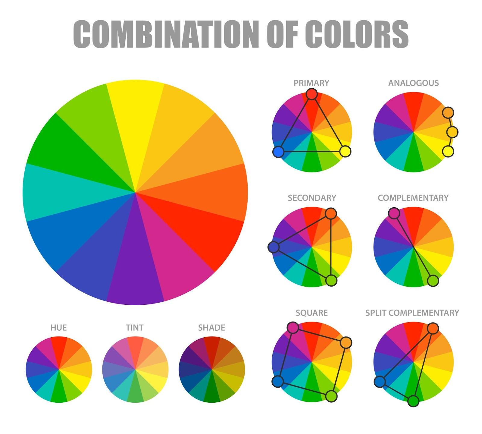
Unlocking Color Philosophies: A Deep Dive into Main Color Schemes
A thorough understanding of color schemes lays the groundwork for creating stunning visual masterpieces, be it in arts, design, decor, or even fashion. These schemes, originating from natural pairings on the color wheel, provide an intuitive guide to mix and match colors for an aesthetic and harmonious appeal.
Here’s an overview of some fundamental color schemes that can be leveraged to create visually pleasing palettes:
Monochromatic Marvels
- Definition: The monochromatic color scheme revolves around a single base color, which is then transformed into various tints, shades, and tones;
- Harmony and Balance: Monochromatic palettes exude an inherent sense of harmony and uniformity, making them perfect for creating soothing and balanced visuals;
- Application: Ideal for creating elegant and minimalist designs, monochromatic schemes are versatile and can be employed in various creative fields, from interior design to fashion.
Complementary Contrasts
- Definition: Complementary color schemes pair two colors that sit directly opposite each other on the color wheel;
- Vibrant Visuals: The inherent contrast between these opposing colors can breathe life into your creations, producing vibrant and attention-grabbing visuals when used in the right proportions;
- Effective Use: Complementary schemes are a powerful tool for adding excitement and drama to your projects, whether you’re designing a striking logo or planning an eye-catching room decor.
Triadic Harmony
- Definition: Triadic color schemes involve three colors evenly spaced on the color wheel, forming a perfect triangle;
- Diversity of Hues: When executed skillfully, triadic schemes offer a harmonious diversity of hues, making them a fantastic choice for projects that require a balanced yet varied color palette;
- Versatile Applications: From painting to website design, triadic color schemes are versatile and can infuse your work with a dynamic and harmonious energy.
Square Elegance
- Definition: Square color schemes utilize four colors evenly distributed around the color wheel;
- Dominance and Accents: These schemes work best when one color takes the lead while the others play supporting roles, creating a visually appealing balance;
- Perfect for: Square schemes are perfect for creating engaging infographics, presentations, or any project where you want to convey information with style.
Rectangular Richness (Tetradic)
- Definition: Tetradic schemes involve two pairs of complementary colors, forming a rectangle on the color wheel;
- Color Variety: They provide a rich variety of colors, but achieving harmony requires careful balancing to avoid discordant visuals;
- Creative Exploration: Tetradic schemes are great for those seeking a challenge, such as interior designers looking to create unique, vibrant spaces.
Split Complementary Sophistication
- Definition: Split complementary schemes are based on selecting a base color and the two colors adjacent to its complementary color;
- Vibrancy with Less Tension: These schemes offer the vibrancy of complementary colors but with less tension, providing an appealing middle ground;
- Ideal Use: Perfect for creating captivating illustrations, this scheme can make your artwork pop without overwhelming the viewer.
Analogous Beauty
- Definition: Analogous schemes incorporate two to five colors that sit adjacent to each other on the color wheel;
- Natural Harmony: Known for their inherent harmony, analogous color schemes are reminiscent of the colors found in nature, making them visually pleasing;
- Versatility: From fashion design to landscape painting, analogous schemes are versatile and lend themselves well to projects where subtlety and cohesion are key.
These are some of the most commonly used color combinations, inspired by nature and perfected through smart selections on the color wheel. For those who prefer a more flexible approach, creating a mood board with chosen color samples can be a remarkable start. It allows for the easy addition and subtraction of colors, offering a real-world view of the color harmony. Once a palette is set, experiment with different tints and shades to create unique visual expressions and perhaps even establish a personal style.
Crafting Unique Color Palettes: A Guide to Harnessing Digital Tools
In the world of art and design, colors serve as the foundation of every masterpiece. However, creating a harmonious color palette can be a challenging task. While some artists have a natural acumen for colors and their combinations, others may need a bit of assistance, and that’s where digital color tools come in. These online resources provide easy and efficient means to create, experiment with, and finetune color palettes.
Check out these recommended tools:
- Canva Color Wheel: Known for its user-friendly design suite, Canva also provides an intuitive color wheel. This tool allows users to generate remarkable color combinations with just a few clicks;
- Color Hunt: This website serves up an extensive array of pre-made color palettes for artists and designers. Users can explore these palettes for inspiration or directly apply them in their projects;
- Design Seeds: Specializing in nature-inspired color palettes, Design Seeds is a wealth of ready-to-use color schemes. The platform presents thoughtful color combinations that are sure to add an organic and aesthetic charm to any design or artwork;
- Adobe Color CC (formerly known as Kuler): Adobe’s Color tool offers a comprehensive platform to create, save, and share color palettes. Plus, it enables users to extract color palettes from images or photographs, which is a handy feature for those inspired by real-life scenes;
- Coolors: A quick and easy-to-use online tool, Coolors lets users generate, adjust, and save color schemes. With options like adjusting color shades and locking colors, this tool provides considerable flexibility in palette creation;
- Paletton: A bit advanced, Paletton goes beyond simple color combinations and helps users create full color schemes with secondary and complementary colors. It also allows users to simulate color blindness, a useful feature for designers mindful of accessibility in their work.
Using these tools not only eases the color selection process but also expands an artist’s understanding of color relations. Nevertheless, the most vital element in creating harmonious color palettes is experimentation. Colors are a subjective medium. Therefore, artists should feel free to explore, test, and play around with different color combinations to find their personal style and preference. Unleash your inner artist with simple and fun techniques in our guide to mastering abstract drawing easily. Get started today!
Conclusion
This article has been crafted with the aim of imparting fundamental yet valuable insights into the realm of color, as well as guiding you on the creation of harmonious color palettes for your forthcoming artistic endeavors. Please feel free to share your preferred color combinations with us in the comments section.